- Home›
- Entertainment›
- 10 Famous Logos That Have Hidden Images
10 Famous Logos That Have Hidden Images
By: Sandeep Gupta Fri, 08 Dec 2017 1:00:05
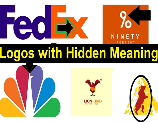
You probably see hundreds of logos every day. How often do you stop to appreciate their details and hidden meanings though? Well, this is your chance. While some are more obvious than others, all of these famous logos hold some sort of secret.
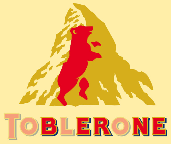
* Toblerone
It seems that sweet makers have a knack for including hidden images in their logos. This one may be hard to spot at first but we’ll give you a hint: Toblerone was started in the city of Bern, Switzerland which is famously associated with bears. Now, look closely at Matterhorn Mountain and see what you find.
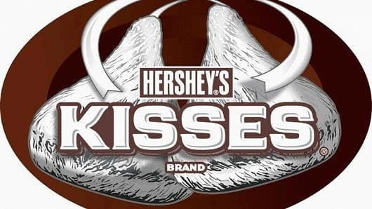
* Hersheys
This one might be hard to see if the logo isn’t big enough but next time you run out of Hershey’s Kisses remember to the check the bag. Between the “K” and the “I” you just might find an extra.
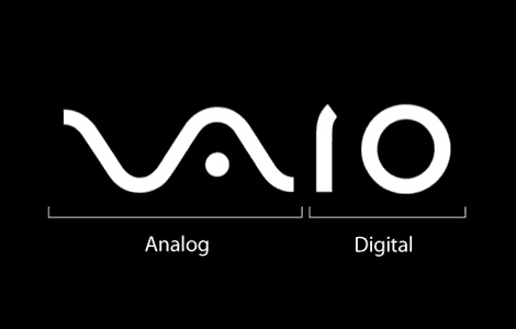
* Sony Vaio
It’s one of the most popular Sony sub-brands and like all of the other logos on this page it also has some hidden secrets. The “V” and the “A” are actually forming an analog signal while the “I” and the “O” are supposed to represent the binary digits 1 and 0.

* Amazon
This one is a classic. Not only is the Amazon logo smiling but there’s also an arrow starting at the “a” and ending on the “z”. That’s right, Amazon has everything from A to Z.

* LG
While Pac Man has a way of showing up in strange places, how about the LG logo? All you have to do is tilt it a little to the right and then shift the “nose” upwards. South Koreans are awesome.

* Sun Microsystems
Before its acquisition by Oracle in 2010, the longstanding logo of the computer giant had left its mark on the industry. Cleverly designed by Vaughan Pratt, you should be able to read the word “sun” from any direction.
* Mammoth
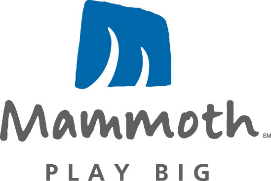
The brilliant logo for the popular ski resort located in California not only looks like a big “M” but it can also be interpreted as mammoth, a mountain, and a ski trail.

* Carrefour
The name of the French international hypermarket chain translates to “intersection” in English. If you look closely enough you will notice that the big “C” in the white space is actually constructed out of two arrows pointing in opposite directions. How appropriate.
* Baskin-Robbins
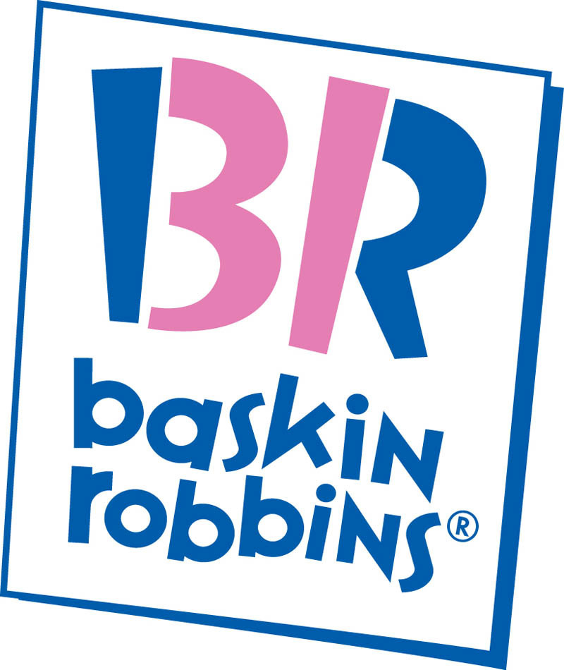
Famously known for its 31 flavors (supposedly so that a customer could have a new flavor every day of the month) Baskin-Robbins makes it known in their logo.
* NBC
Another famous one, anyone over 50 will connect NBC with a Peacock. Ever since they came out with their new logo though, the peacock has been a little harder to spot.


